If you’ve been following this blog in any capacity for the last few weeks, you’ll know that I’ve been making my way through hundreds of documents associated with the Walker Art Center. Like any archive, it’s got its quirks in terms of inclusions and omissions, but one thing that’s stood out to me from a visual standpoint is the personalized stationery I’ve been seeing in the correspondence. Let’s take a look at some examples.
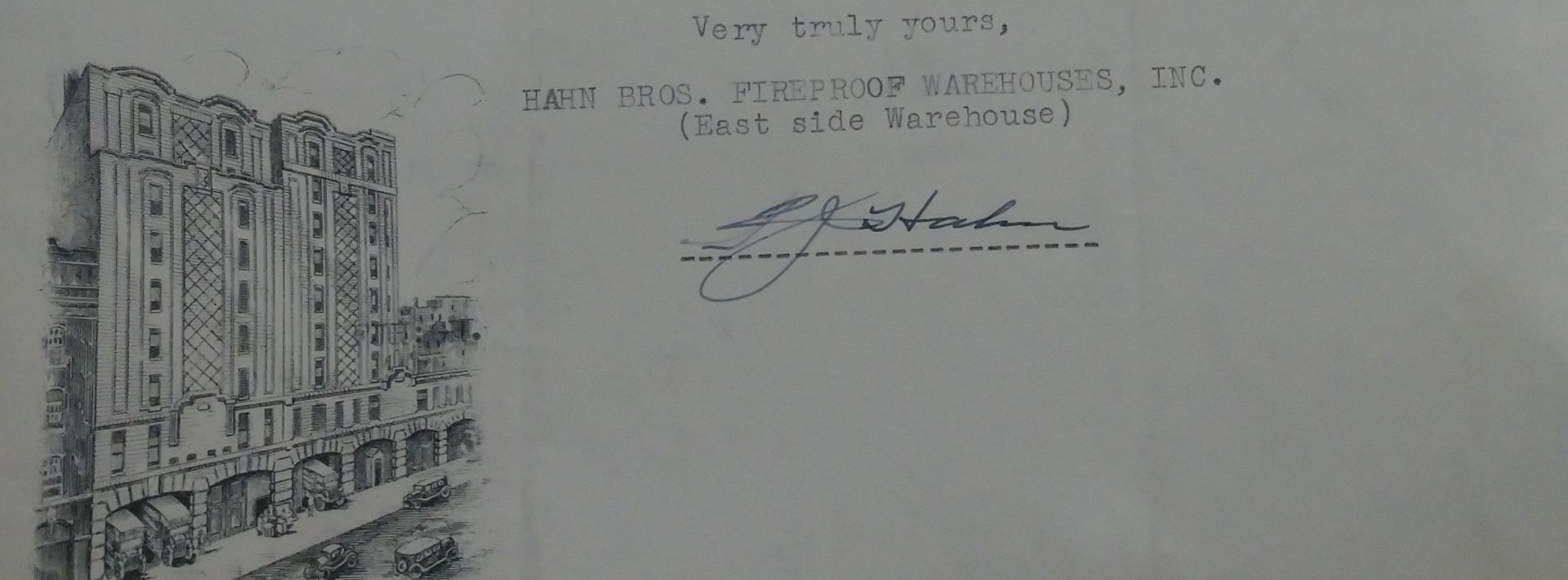
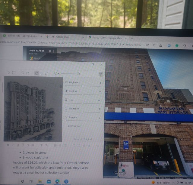
One of the stationery designs that struck me was this example from the Hahn Brothers, a New York warehouse company that the Walker Art Center used to pack and ship many of the pieces featured in its early shows. While reading through the letters clarifying drop-off dates or packing requirements, I started wondering about the building depicted in the illustration. After noticing that the letterhead printed two addresses for the company, a western site and an eastern one, I typed them both into Google to see what would happen. It turns out that the illustration depicted the western site, and that it’s still extant today as a storage facility, albeit under a different company. A little more research uncovered that the building was first erected in 1915 as the home of the Chelsea Storage Warehouses. William F. Hahn worked at the company for several years before establishing his own business with his brother Frederick in the 1920s, taking over the Chelsea company site. Hahn Brothers would continue to operate there until the 1970s; today it is managed by Manhattan Mini Storage.
Other examples address the significance of fundraising and soliciting to the Art Center’s history. In order to guarantee federal support, the Minnesota Arts Council needed to raise $5,500 in 1939, which means there are a lot of letters in the archive from local businesses, volunteer organizations, and individuals either confirming or denying their donations. While the letters themselves are significant for their content, a lot of the local businesses have interesting stationery.

The example above is from the Young-Quinlan Department Store, based in Minneapolis. First established at the turn of the century, the store specialized in high-end, ready-to-wear fashion for women, then uncommon at the time. Elizabeth Quinlan, co-founder and manager of the store, commissioned French designer Armand-Albert Rateau to create a logo for the store in 1927. That logo, an Art Deco design embodying the modern woman’s sense of independence and style, would go on to embellish shop boxes, the main building itself in the form of a bronze plaque, and as we see here, stationery.

And here’s my personal favorite example of illustrated business stationery. Founded in 1858 in St Louis, Missouri, the Bemis Bag company eventually became a global manufacturer of bags and other packaging products before being acquired by Amcor in 2018. The company’s logo was supposedly inspired by a real cat named Biddy, and went through various iterations over the years before being retired in 1962.
There are just a handful of examples I’ve observed in the archive. I don’t know if anything will come of these beyond sharing them here. From a mobilities studies perspective, I find the mobility of architectural sites as rendered through letterhead an interesting and potentially productive line of research, but I have enough to do in my dissertation already without going down that rabbit hole. Yet it’s still a compelling group of images, these printed letterheads. Part of the appeal is undoubtedly the nostalgia, warranted or not, that comes from working through primarily electronic correspondence and getting caught up in the imagined romance of slower, seemingly more intentional forms of correspondence. Yet I’d like to think there’s more than nostalgia at play in my case. After all, as someone who likes to design and print my own holiday cards every year, I appreciate the labor these companies and their designers went through to create their distinctive stationery, leaving their mark through both images and words.
But if nothing else, you’ve gotten to see a very cute kitty today.