Another year, another holiday card. Okay, this year was more eventful for me than others. Despite all the changes though, I’ve kept up my card-making practice. Today then, let’s take a look at what I’ve printed for 2024.
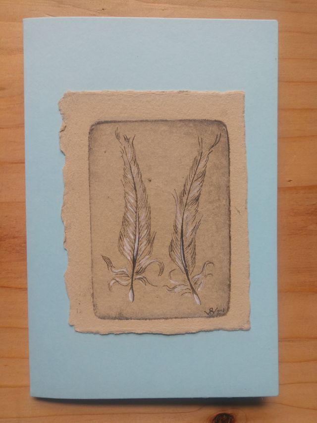
Inspiration for this year’s holiday card
I’ve been fascinated with pelicans ever since I first saw them as a kid during a school trip to Catalina Island. That interest has not abated in adulthood. The first time I visited Florida with Brandon, I was immediately taken with the pelicans I saw flying around the Gulf. Nowadays, I get to see them regularly in and around Norfolk, but the novelty has never worn off. During the months I commuted between Norfolk and Williamsburg, they were a welcome sight while waiting on the Hampton Roads Bridge Tunnel.
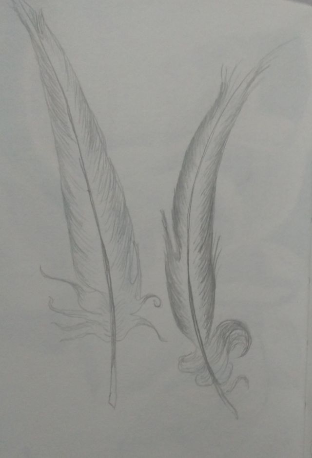
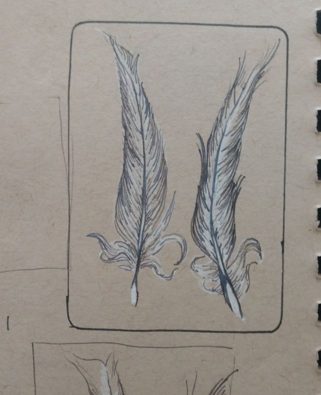
This year then, I decided to pay homage to the pelicans I’ve spent the past year watching. With that in mind, I decided to base this year’s card on a sketch I did of some pelican feathers earlier this summer, during a trip to the beach.
Choosing a process
For this year’s card, I decided to go with a two-tone etching. This process entails creating two separate plates, loading them with different colored inks, and printing them over each other on the same sheet of paper.
Three different sources informed my decision. The first was the coloring of the pelican feathers themselves, which featured contrasting tones of white and dark brown. I could have just printed a single plate in black ink on white paper to capture this effect. That felt a bit simplistic though, especially since I try to use a different printing technique every year. I decided then, that printing two plates in black and white on a medium-toned paper would result in a richer effect. It’d be similar to charcoal drawings I’d done on blue, gray, or other medium-toned papers in high school and college.
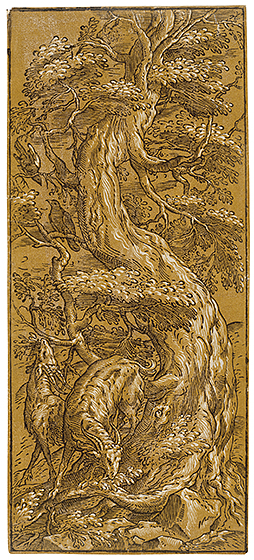
The second source is my ongoing interest in chiaroscuro woodcuts from the sixteenth and seventeenth centuries. Like my old charcoal drawings, these works consist of two impressions printed on the same paper. One printing consists of lines in black ink, the other in white. The result is different from single-tone woodcut prints because the white highlights stand out from the medium-toned paper. When used well, it’s a technique that enhances a print’s three-dimensional appearance.
Referencing my earlier work
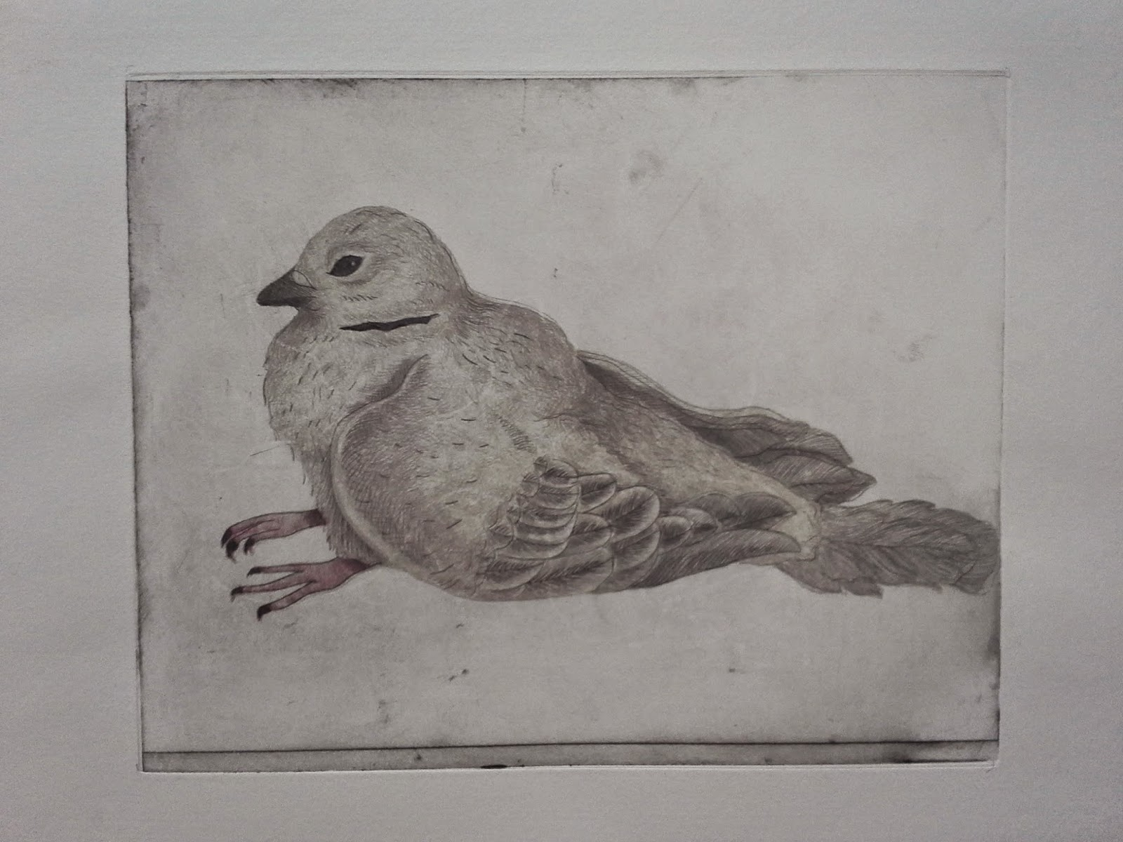
The third inspiration was one of my earlier printing experiments. Several years ago I became interested in multi-plate etchings after encountering one online. After reading about it, I decided to make my own, creating a four-plate Plexiglas drypoint based on a dove I’d sketched a few months earlier. Like many projects, I never advanced beyond the proofing stage because the process of inking and printing four plates for a single image was tedious. I liked the result though, and always wanted to try it again. I figured a two-plate etching on a smaller scale would be a more manageable way to revisit this technique.
The final step of figuring out my technique was determining what kind of paper to use. Initially, I thought about using blue paper, to suggest the clear blue skies I often saw the pelicans fly across during my commute. Ultimately, I decided on brown paper to evoke the actual plumage of pelicans. To suggest the clear skies, I’d mount my prints to blue cardstock.
Printing the holiday card
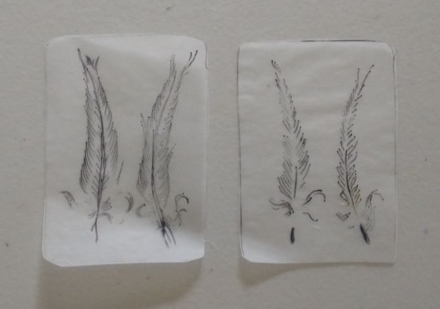
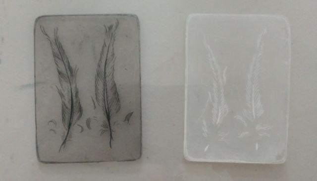
Once I had settled on a technique, it was time to print my image. I started by making a preliminary sketch in black ink and white paint on brown paper, to see how the print would look. After I was satisfied with the design, I made two, at-scale drawings of the feathers on tracing paper. One drawing represented the feather parts I’d print in white ink, the other in black ink. From there, I placed the two drawings under my Plexi plates and copied them with my etching needle. I also augmented the basic drawings with additional line work, using light pressure to create fine details. Then, over a Saturday afternoon, I printed the two plates onto tan paper. Because I’d need to register the plates perfectly to have the two images overlay one another, I printed with the black ink first, knowing I’d have an easier time seeing it.
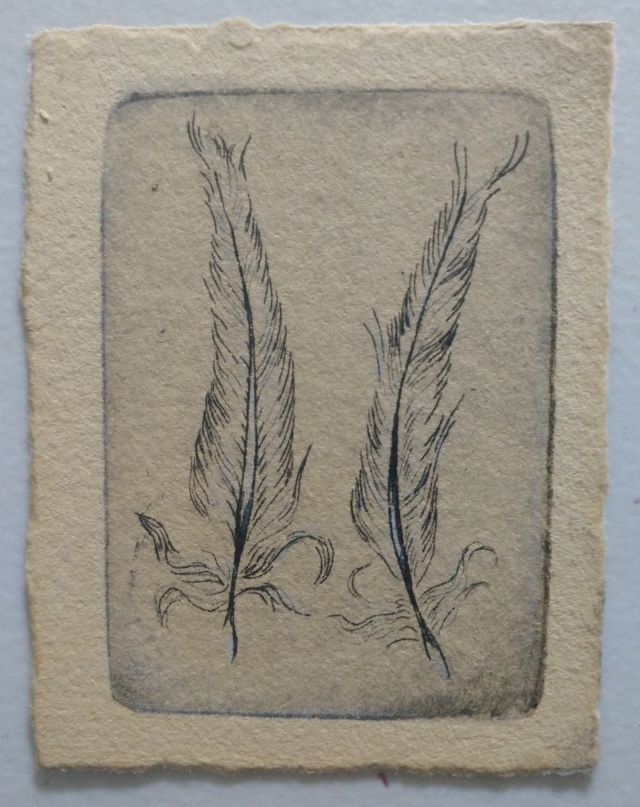
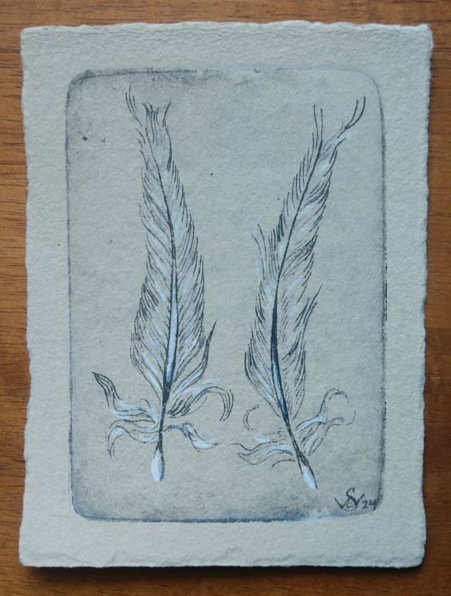
In hindsight, I should have printed the white plate first. A lot of the white ink ended up mixing with the wet black ink and turning gray. It wasn’t the end of the world though. After the prints had dried, I went back with some white paint and added a few brushstrokes to each print to enhance the highlights. I also used one of my fountain pens to add a few more lines in black ink, making each print a unique impression.
Reflections
Overall, I’m rather pleased with how this print came out. The clean registration of the two plates, along with the retention of fine detail, show me how much my skills as a printmaker have improved over the years. From a technical perspective, it’s one of my better images.
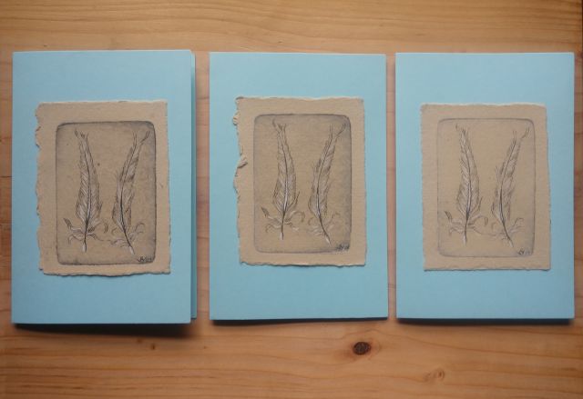
I also think it speaks well to this particular moment in my life and the changes that have defined it. For me, the pelican was an envoy from one life chapter to another, and I wanted to share that sense of transition with my friends and family. Like every other printing technique I’ve used for my cards, I also see the potential for bigger projects, if I get around to them.
Good tidings, everyone.