I few months ago I had mentioned that I was working on a couple of projects with the Barry Art Museum after wrapping up Motion/Emotion. Last week we officially opened those projects to the public. For the next couple of weeks then, I’ll take you through what we’ve been working on together. Today, we’ll look at the biggest project in terms of space: the reinterpretation of the Doll Gallery.
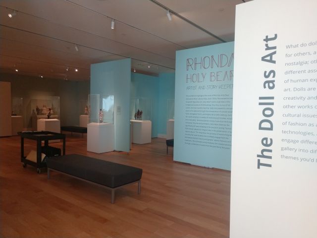
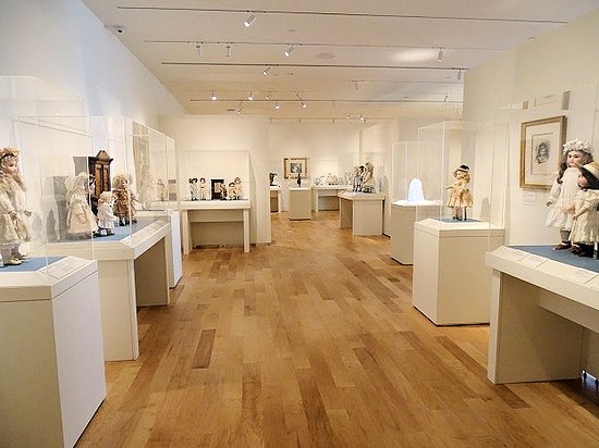
When the Barry Art Museum first opened, the Doll Gallery was organized in a chronological format, taking viewers through the history of dolls while highlighting major designers or manufacturers along the way. This organization worked fine, but over the years it started to become muddled as dolls were added or removed, works of art put on the walls without necessarily engaging the objects in the gallery space, and so on. A temporary gallery space had also been added to accommodate rotating shows, but since it wasn’t part of the initial layout it felt less like an intentional space than an afterthought. The staff decided then, that it was time to rethink the space and do a complete reinstallation. They met with the founder to takes notes on the collection, collaborated as a team to brainstorm potential reinstallation ideas, and looked up examples of other gallery reinstallations to see what they liked in terms of layouts. In short, they did a lot of preliminary groundwork for the space. What they needed now was a curator to oversee the conceptual process, someone who would provide the project with a guiding vision or framework.
This was where I came in. My role was to take all of the different ideas I was hearing from the museum staff, collectors and other experts, the founders, student audiences, and any other potential stakeholders, and render them into a coherent whole. In essence, I was the synthesizer.
To do this, I started by listening. I’m neither a doll expert nor a full-time employee at the museum, so I knew I’d need to lean heavily on the expertise of others to bring this project together. Early in the process, I walked through the gallery with different stakeholders to learn their perspectives on the dolls. I learned which dolls were considered the most significant from a historical or aesthetic perspective, and started becoming familiar with the major names and makers. I also learned which pieces visitors tended to like regardless of their significance, and made notes to include these as well. After all, who cares how many important objects are on view if visitors aren’t interested in them?
After a few weeks of listening and doing my own research, it was time to come up with a layout. Before conceptualizing any checklists or object placements, the first thing I did was decide what exactly the new installation needed to accomplish as a space. Based on the conversations I’d had, I determined that the gallery needed to accomplish the following:
- Have a layout that easily allows dolls to be added or removed for conservation purposes
- Have a more intentional temporary gallery space
- Appeal to both general audiences and specialist collectors
- Be ADA accessible
Once I had established these criteria, I was ready to move forward. While I briefly considered a couple of schemas, including geographic and chronological, I soon decided that a thematic organization best fit the museum’s needs. My main inspiration was the Crystal Bridges Museum, which I had visited recently. I thought a similar format would work well for the Barry collection because it would provide greater flexibility than chronological or geographic frameworks. By establishing relationships through themes rather than time period or geography, the Barry could potentially arrange its dolls in any number of relationships, allowing them to converse with one another across time and place. Additionally, by opting for a thematic organization, I wanted to empower visitors to explore the gallery according to their own interests, rather than be bound to a specific layout or order of works.
After trying out a few different themes, including travel and consumerism, the Barry staff and I settled on the following:
- Dolls and Fashion
- Dolls and Technology
- Dolls and (Popular) Culture
- Dolls and Art
Once we had settled on the themes, I went to work on the layout. Rather than come up with a singular narrative, I divided the gallery into modules, allowing visitors to move through the space in whichever order best suited their interests. I also addressed the temporary gallery by repositioning it in the center of the main space, using temporary walls to form a doorway. I then worked on the checklist, deciding which dolls to keep on view, which ones to bring out from storage, and which ones to return to the vault. From a visual standpoint, this was probably the most striking change, as I significantly reduced the number of dolls on view. I made this decision for both aesthetic and practical purposes, as fewer dolls meant fewer pedestals, which meant more space for wheelchairs and other ADA requirements.
After working on the layout, I moved onto other tasks. I wrote all-new texts introducing each of the sections, and drafted labels for dolls coming onto view. Once I had written these, I worked with the Director to pick out wall colors for the different sections, ultimately opting for pale pink for the fashion section, and a sage green for the art module. Some of the dolls with moving elements or other technological enhancements were also filmed, and I recorded the accompanying audio. As with Motion/Emotion, I had little to no part in the actual installation, but I drive down once or twice to see the gallery as it developed and to address any potential issues, such as having backup dolls available just in case we needed them, or reconfiguring a wall in the Motion/Emotion show to accommodate moving one of the automata back into the Doll Gallery.
After months of work, we opened the space on August 30.
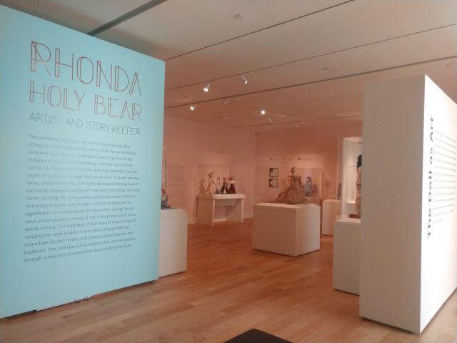

From the onset, this was a collaborative project, and I don’t take sole credit for any of it. Part of this is the practical reality that my hours are extremely limited and I can’t spend a lot of time on every single detail, but it’s also reflective of the Barry’s approach to curatorial work. Staff members refined and adjusted my gallery layouts to better fit their needs as a space, and the checklist I created was modified through additions and other changes to spotlight different ideas or concepts. The vinyl and other texts were all designed by museum staff, as they have a lot more graphic design experience than I do. Everyone also read and edited my labels. The Museum’s Educator, Suzanne Peterson, actually wrote one of the most innovative texts in the gallery, a panel describing the different materials used to make dolls; I just edited it for length. I also reused a lot of the text labels for individual dolls, either leaving them as is or updating the language slightly to fit my own writing style. In essence, the renovated Doll Gallery continues the collaborative approach that defines the Barry Art Museum’s approach to exhibitions and, increasingly, my own curatorial practice.
Regardless of how it came together, however, the important thing is that the Doll Gallery reinstallation looks fantastic. Everyone is very pleased with how it turned out, and it should be a much more effective space for tours and other events in the future. I’m proud of the work we’ve done on this space, and I hope it better serves the needs of visitors.
This isn’t the only project I’ve been working on though. Next week we’ll take a look at the inaugural show in the Doll Gallery’s new temporary space, Rhonda Holy Bear: Artist and Story-Keeper.