Visitors to my website may notice that it looks a bit different these days. That’s because I just finished refreshing it. Let’s take a look!
Why Refresh My Website?
I try to update my website every 2-3 years. In the world of web design, tastes change quickly. What starts out looking fresh or edgy can end up dated and tired within a short time.
I started thinking about updating my site back in April, after being asked to participate in an Equality Lab workshop about personal websites. As I reviewed my pages, I started thinking that the minimal style appeared sterile rather than sleek. I also thought my profile picture, which I’d taken myself on my phone, could benefit from more professional lighting. Ultimately, I used the website’s dated appearance to my advantage, as I ended up discussing the importance of scheduling time to maintain personal sites, including periodic redesigns. But workshop benefits aside, I knew it was time to reconfigure it.
The job market was my main reason for refreshing my site. In addition to completing the dissertation, the Halleran Fellowship is about looking for work because you’re finishing the Ph.D. program. Since I’ll be searching for new positions this year, then, I wanted to make sure my website was up-to-date as a portfolio.
Keeping My Expectations Realistic
The last time I redesigned my website, I did a complete overhaul by installing a new template and redesigning every page. I initially intended on doing that again, but I quickly realized that demanded more time than I could afford. When I redesigned the site in the spring of 2021, I had just started the dissertation. I couldn’t schedule research trips due to the pandemic, so I spent most of my time perusing available resources online. In other words, I could spend hours of free time tinkering with different layouts.
In 2023 though, things are very different. I’m finishing the dissertation, looking for work, and resuming my ongoing commitments with the Barry Art Museum. My time has become finite. As much as I wanted to completely redo my site then, I recognized that I couldn’t spend my limited time getting caught up in the weeds of redesign.
Instead, I wrote out my reasons for reconfiguring the site. I determined that updating its content was more important than overhauling its appearance, so I focused on that. Rather than try to learn a new template, I kept my current one, since I was already familiar with it.
Small Changes Can Make a Difference
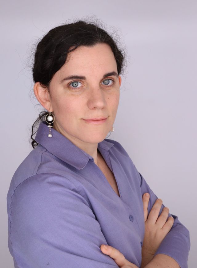
Although I wasn’t completely redesigning my website, I still found small but meaningful ways to update its appearance. I changed the background to a lighter shade of gray, and enabled the dark mode option. I also changed the headshot on my homepage, courtesy of the free professional photo booth at the Cohen Career Center.

The other major visual change I made was to the menu. Previously, I listed my portfolio on a menu in the top right corner, where visitors could scroll to different pages. I removed most of those items from the menu, limiting it to my blog and contact page. Instead, visitors can now access my portfolio by scrolling down the main page and clicking on photos directing them to exhibitions, publications, or art. While the actual layout is basic, having additional pictures on the main page adds visual interest while giving visitors a preview of my work.
A Tour of My Website
My revamped website includes updated pages as well as new ones that expand my portfolio. In order to showcase the variety of projects I’ve worked on, I created a projects page dedicated to all of my scholarly endeavors, from my digital humanities work to events I’ve helped organize. I’ve also added a page for the dissertation, where I include summaries of all the chapters. Since public speaking is such an important part of my work, I created a page dedicated to my speaking and media appearances, including links when available. For all of my pages, I refreshed and revised my introductory texts.
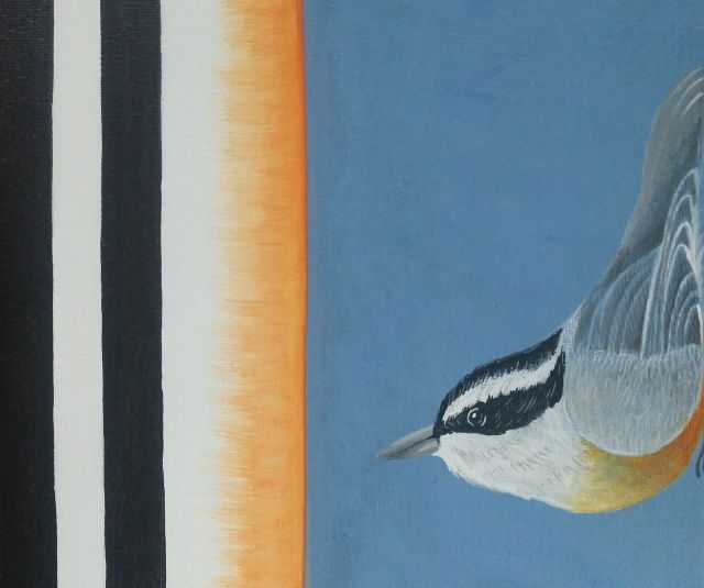
I also significantly expanded my art portfolio. I added separate pages for the different media I use, so that I could upload more examples. Under the paintings page, for instance, I included examples of the wall painting I’ve been doing in the house. I also created a new page for commissions, since I do occasionally accept requests for pet portraits, painted furniture, and other projects.
While I didn’t delete a lot of content, I did remove my CV page because I thought it looked boring. I also decided it was unnecessary since I now have different pages dedicated to every kind of work I’ve done. I’ll include a link to a downloadable CV for visitors who still want access to it, but I don’t need a separate page dedicated to it when I have more effective ways of displaying that information.
Keeping the Future Open
Ultimately, my main goal with this website refresh was to demonstrate the versatility of my work. I don’t know what’s going to happen in the next year. I might be working in a museum, or I could be teaching. Perhaps I’ll hold a postdoc. Or maybe I’ll do something else entirely. Regardless, I wanted to showcase all the work I do so that I can engage a variety of potential employers.
While I may not have completely redesigned the site as I had originally intended, ultimately it works for where I’m at right now. To me, its simple design reflects my openness to new opportunities. Once I have a better sense of my future plans, I can reconfigure its aesthetics. But for this chapter of my life, it works fine.