
Frequent visitors to my website may have noticed that it looks different nowadays. That’s because I decided to redesign it a few months ago, and have finally finished working through the updates. Today then, I’ll take you through the redesigned website and its new features.
Unless you’re the 1996 Space Jam website, it’s generally recommended to redesign your site every 2-3 years, although this is just a suggestion and everyone’s situation will be different. This is because, like fashion, tastes change, as do templates, widgets, and other features. My first blog, The Fanciful Lobster, went through several redesigns during the five years I used it, with its final iteration looking quite different from the first one. Even though I don’t actively post on it anymore, sometimes I think of refreshing it because it’s starting to look pretty dated.

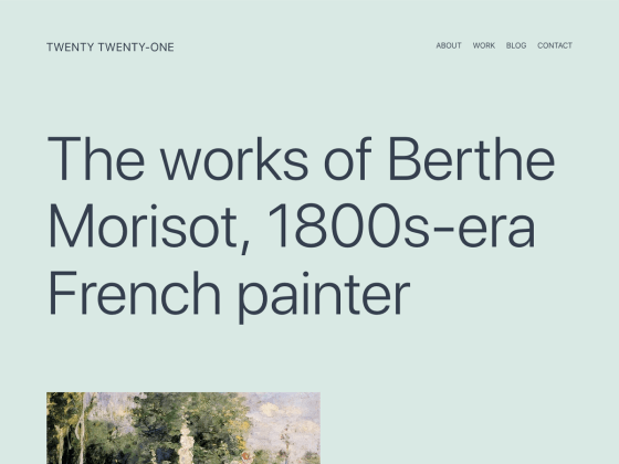
As for this website, this redesign is the first one it’s had since I created it back in 2018. In terms of appearance I wanted something clean and modern without being too hard-edged, so after trying out a few different templates, I settled on Twenty Twenty-One, a new WordPress template geared for portfolios. Aside from changing the default background color from a pale teal to a light blue-gray, I kept the basic design in terms of layout and fonts. While I am familiar with HTML thanks to a class I took as an undergraduate, I didn’t feel the need to edit the design on the code level.
One of the major changes to the website is the navigation menu. When I first created my site I only had three or four items on it, but as I continued adding new pages, it started getting cluttered. For the redesign then, I decided to streamline the navigation menu by adding a submenu. By grouping my exhibitions, writing, art, and digital humanities projects together under the title “portfolio,” my navigation menu feels less cluttered, in keeping with the simple aesthetic of the website design.
In terms of content the actual pages haven’t changed that much, as I make an effort to keep my information up to date. Most of what I had to do was readjust the pictures, as they got thrown out of alignment when I switched templates. I also fixed some long-forgotten typos and revised some of the texts.
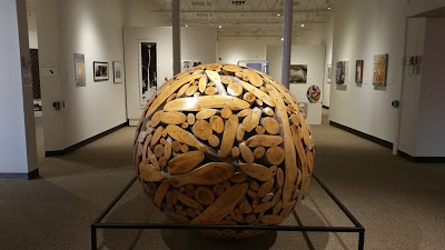
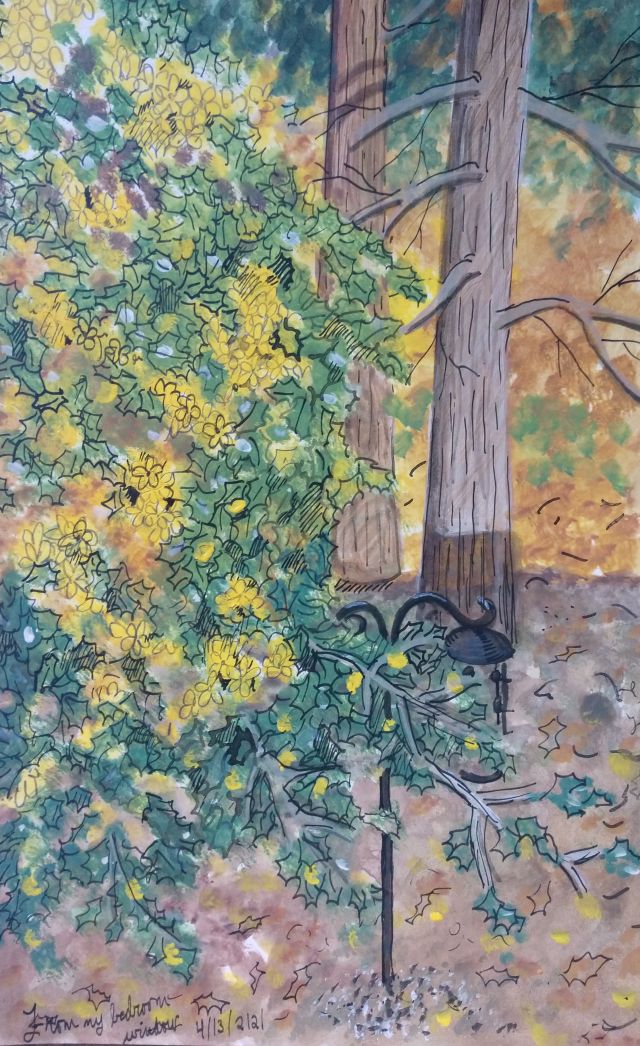
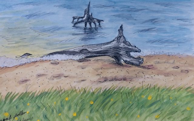
Of all the pages, the one dedicated to art has changed the most. In the first version of the website, I had artworks organized into a gallery of thumbnails; viewers needed to click on thumbnails to see the full image. To simplify the experience, I now have full-size images in one continuous column organized by medium, allowing viewers to scroll through my work without having to click on anything. Given how important sketching is to my practice, moreover, I’ve also added several pages from my sketchbooks, which I’ll periodically update.

Overall I’m happy with the new website. Redesigning involves a lot of time and tedium, but it’s also fun to play with different appearances and ways of sharing your work. I like this design though, so I’ll keep it. Until the next redesign, that is.