The arrival of December means a new holiday card for friends and family. As longtime readers know, every year I try something new when I make my cards. Whether it’s changing my technique, or showcasing different subject matter, no two years are the same. This year’s card stands out in both method and content. First, I decided to use monotyping, a technique I’ve used for years but had never applied to holiday cards.
Second, rather than have an edition of identical images, I opted to print 32 one-of-a-kind images that together created a larger composition. Each recipient gets a print that’s both a unique image and part of a larger whole. Let’s take a look at my process.
What are Monotypes?
As the name suggests, monotypes are unique prints, and essentially are printed paintings. You paint directly onto the plate and run it through the press. Monotypes have a unique and intriguing surface appearance because they record the impressions of brushwork without having the same body or texture. Many artists combine monotyping with other techniques, resulting in richly layered, complex pieces.
I’ve used monotyping for years, and it’s actually the first printmaking technique I learned. Since you don’t need special equipment or skills beyond painting, it’s easy to pick up and offers a lot of versatility. I’ve most often used it for mixed media works, combining it with drypoint and other techniques. But until this year, I’d never used it for cards. Since monotypes are unique, they seemed impractical when my main goal was producing a consistent edition for my friends and family.
Inspiration from Benjamin Wigfall
I decided to use monotyping after visiting Benjamin Wigfall and Communications Village at the VMFA. Wigfall was an abstract painter and printmaker who founded a collective studio and art center called Communications Village. He created it to engage Black artists and communities, as he knew from personal experience that museums and galleries could be unwelcoming.
I had originally gone to the show because I thought it would be relevant to my dissertation research. It was, but what really caught my attention were Wigfall’s actual printmaking experiments. Although his prints focused on intaglio or relief printing rather than monotypes, the emphasis on experimentation itself inspired me. It encouraged me to approach the holiday card as an opportunity to advance my own creative practice, rather than just making a fun image that would please friends and family.
Although I already had a composition in mind for this year’s print, I jettisoned the idea after attending the exhibition. I had something more ambitious in mind now.
A Flock of Blackbirds
Last winter I encountered an unusual spectacle. While out on an afternoon walk, I passed by a field of tall, dried grasses. An enormous flock of red-winged blackbirds that had been resting on the ground suddenly took off into the sky, contrasting with the muted reds and yellows of the grasses. The scene was so striking that I sketched an abstraction of it that night. I had no idea what I’d do with it, but I wanted to capture it while it was fresh in my memory.

I’d been thinking about painting a triptych of this scene for a few months. And like so many projects, I hadn’t gotten around to it yet. After seeing the Wigfall show, however, I decided to make it the subject of this year’s print. And rather than divide up the scene over three panels, I’d render over thirty-two individual prints.
Triumphal Arches and Small Spaces
In addition to the Wigfall exhibition, two ideas or sources inspired my process. One was the Triumphal Arch, a monumental woodcut print I saw at the New York Public Library this summer. Commissioned by the Holy Roman Emperor Maximilian I, the print is a composite image of 195 individual woodblocks that form a massive triumphal arch. Aside from marveling at the technical skill of these prints, I loved how each image was a beautiful work on its own while simultaneously contributing to a much larger whole.

I also wanted to explore how the practical challenges of space have informed my practice. With my printmaking especially, space informs both the scale and medium of my work. When I lived in Vermont and rented studio space at Burlington City Arts, I created large prints because I could get big and messy. In Roswell, my works shrank because I used the museum’s smaller presses. Here in Williamsburg, I make prints at home. My studio is my kitchen, and as a result, I’ve made card-sized prints exclusively, using my tiny press from the Open Press Project.
The question of space isn’t unique to me. For women especially, working in the home to maintain a creative practice while balancing domestic labor is not unusual, as Diana Seave Greenwald argues in Painting by Numbers. But until recently, I only thought about the challenges of working in limited areas in practical terms. I hadn’t deeply considered how those intimate spaces could inform my aesthetic, or how I could work with them to create something more monumental. Through these prints, I’d embrace the intimate scale of my work while also creating something bigger.
Preparing the Composition
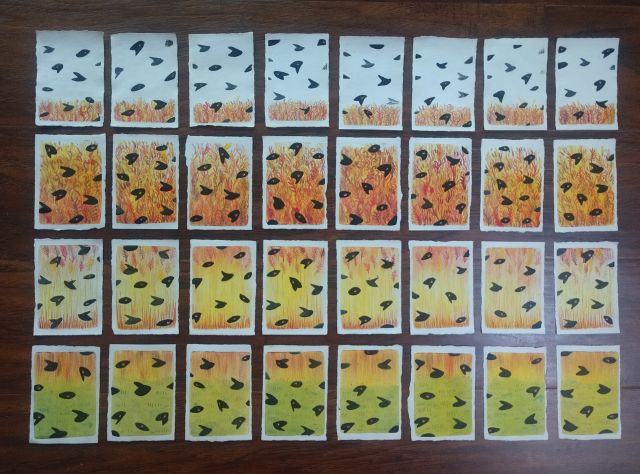
Although I vary my actual techniques, for the past decade my holiday cards have followed the same method. I settle on an image, and draw it in reverse. I then copy that mirror image onto the plate, and fill in the details. Since all the prints are multiples, I only need to work out the actual composition for that first image. For this year’s cards, my objectives were different. I not only wanted each print to stand on its own, but also to contribute to a larger composition. Every print would need to work as both an individual card and as one section of a much larger scene.

To accomplish both objectives, I first needed to figure out how many prints I wanted to make. I checked my list of recipients and determined that I would need at least 30 impressions to cover everybody. After trying out a couple of configurations, I opted for 4 rows of 8 prints for a total of 32 impressions. Once I had settled on the final number, I repainted my original sketch on a grid. This would serve as my guide during the printing process.

Making the Monotypes
Once I had determined my overarching composition, it was time to print the individual impressions. I decided to take on the project one row at a time, painting 8 impressions during each session. I’d take on one row each weekend, with each session lasting about three hours from initial setup to cleaning.

As with any new creative process, there was a learning curve as I got more familiar with what I had in mind. I had numbered the paper sheets to correspond with the grid I’d made, for example, because I wanted to make sure they lined up with the original composition. As the prints started coming together, however, I found it didn’t matter if they all lined up perfectly. Partly this was because of the abstract quality of the scene, but the prints themselves also made a difference. The original sketch was one scene, so you’d notice if the individual elements didn’t align. The negative spaces between the prints, however, changed the composition by implying there was an unseen space or landscape in between the actual impressions. It didn’t matter if they didn’t align, because the gaps connected them.

I had originally planned on completing the monotypes in about four weeks. I ended up getting so into the process, however, that I finished them in two. So it goes when you’re having fun, right?
From Monotypes to Cards
After I finished the monotypes, I added some hand-painted details to each scene. Sometimes this was out of necessity, such as a blackbird not printing very clearly, but I also added these details to enhance the individuality of each work.
Eventually, I had this:
The colors weren’t quite the same as in the original sketch, but that was fine. Considering that I printed these in September, I know I was thinking as much about the approaching fall as anything else.
Now it was time to make the cards. I still had some leftover cream-colored cards from previous years, so I decided to use those. To help the prints stand out from the neutral background, I also cut up a few leftover red and green cards to create a more colorful backing. After a couple of evenings, I had my cards.

Reflections
I really enjoyed this process. I like the concept of printing individual works with the goal of creating a larger composition. It’s an elegant response to the practical challenges of working within a small or limited studio space.
But I also love the idea of taking that larger composition and rendering it intimate again. I find the idea of taking this landscape and mailing it one piece at a time to all my friends and family a creative way of showing how they all connect to my life. Together, they all give my life richness and meaning.
Beyond these prints, I also see opportunities for further expanding my creative process. I can see myself creating “flocks” of prints that represent different landscapes or other subjects, with each work both standing on its own and contributing to a larger whole. Brandon has also recommended their potential as hand-printed playing cards and other media. In short, I don’t think this is the last time I’ll be using this method.
Good tidings, everyone.
alot of work and a beautiful result!
Thanks!