As followers of my previous blog, The Fanciful Lobster, may remember, I make my own holiday cards every year. Initially, this served as my proverbial fist-shaking at the consumerism of the holidays, but with seven years’ worth of cards under my belt, it’s now become a tradition unto itself. It’s my way of checking in on family and friends, all while sending them a hand-pulled print to boot.
Every year I vary the technique and subject matter, with the only stipulation being that the card reflects based on my surroundings. The first year I was in Roswell, for example, I made a dragonfly print in reference to the dragonfly festival I attended at Bitter Lakes. Last year, I made an ox print based on a fresco by Peter Hurd that I had seen at Los Poblanos, one of my favorite places in New Mexico. Having recently moved to Virginia, and with Brandon starting an exciting new job as a senior preparator at Colonial Williamsburg, I decided a print referencing CW was in order. After wandering around the complex and looking at the various edifices, I decided on this little building:

Since I don’t have access to a printing press at the moment, I decided to make a linocut so I could print these at home. I had already done a relief print last year, so I decided to make a white line print, a 20th-century technique that works quite well with architecture. Instead of carving out the areas you want to leave blank, you carve out the outlines only, and color each resulting section individually.
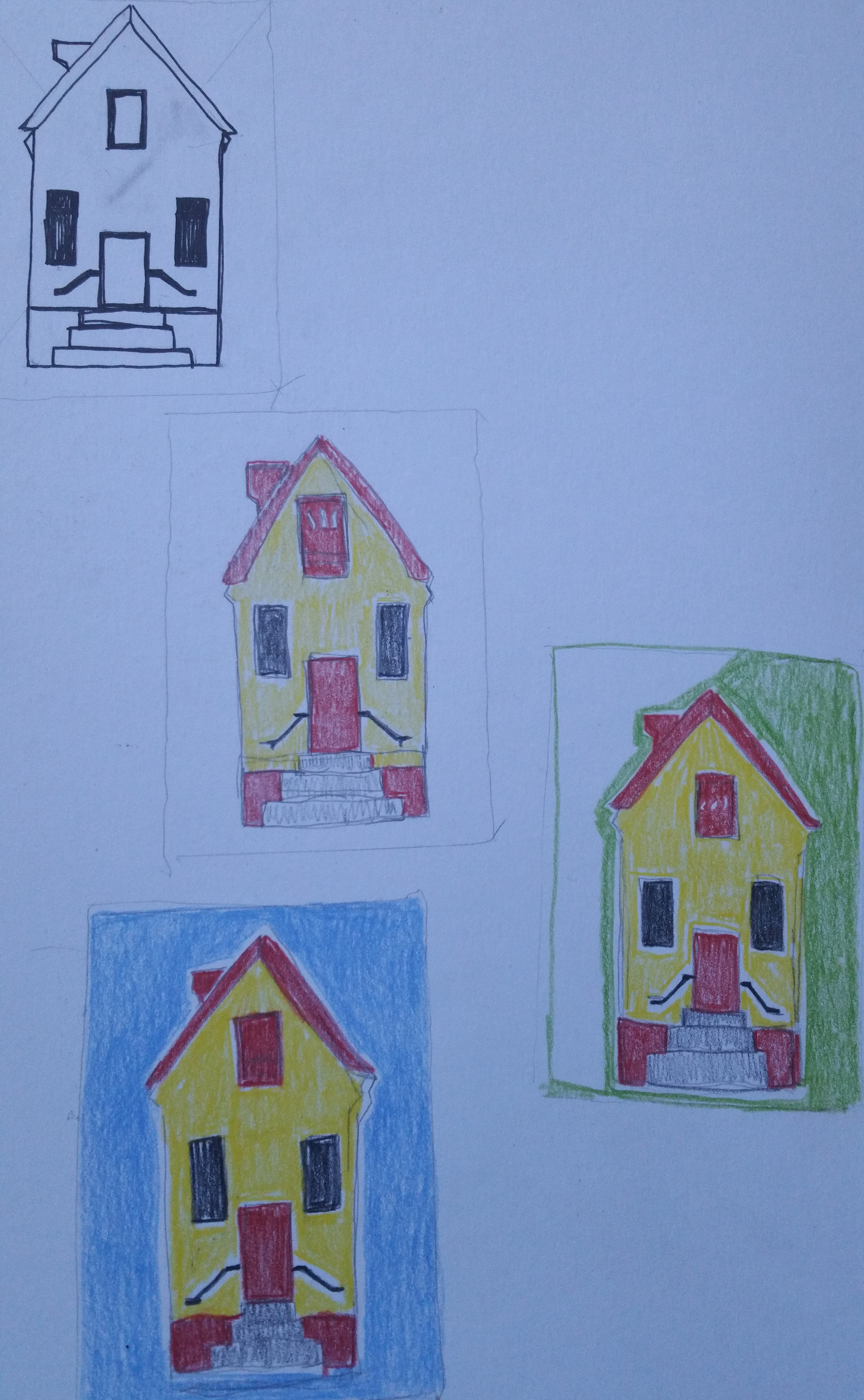
Having decided on a technique, I spent the next few nights abstracting and simplifying the building. I thought about painting the background blue or green, as you see below, but I decided to save myself a little work and leave it white.
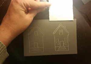
I pulled out one of my linoleum pieces and carved the image. The one on the left is the first attempt. I thought it was too lopsided so I carved it a second time. The final image is crooked too, but it was less pronounced. I also thought the imperfections added a vernacular sort of charm.
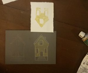 It was then time to print the images. To ensure consistent registration, I taped each sheet to the top of the linoleum, allowing me to flip back and forth easily while I colored in each new section. Since it takes a few minutes to prepare each part, I chose slow-drying oil paints so I wouldn’t feel rushed. I then printed one color at a time, from yellow, to red, to blue, and finally a brownish-purple for the steps. I cheated for the railings by drawing them in with a micronpen, as they turned out sloppy when printed.

I deliberately went with a primary color scheme because I wanted a bright, colorful image. Primary colors are also associated with stability and simplicity (think of Wonderbread and children’s toys), which also felt appropriate. Brandon and I both like Williamsburg and the opportunities we’ve had here so far, so I wanted to visually convey how content we feel being here.
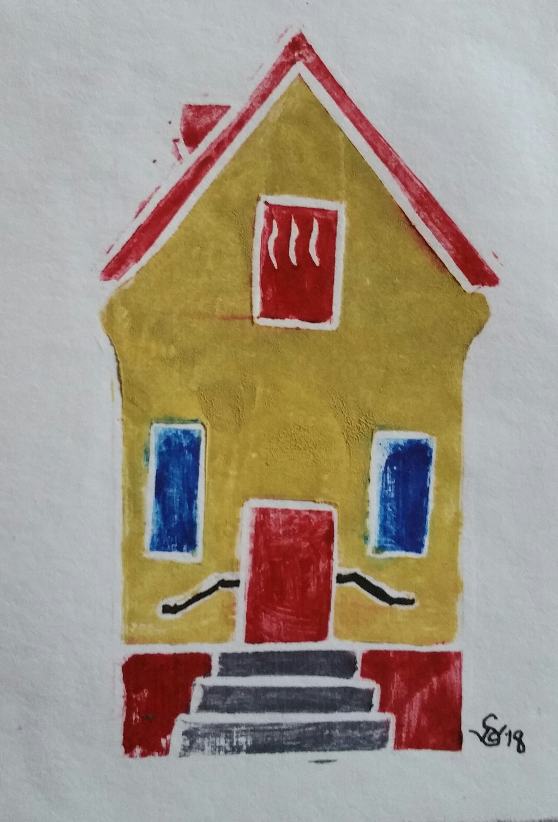
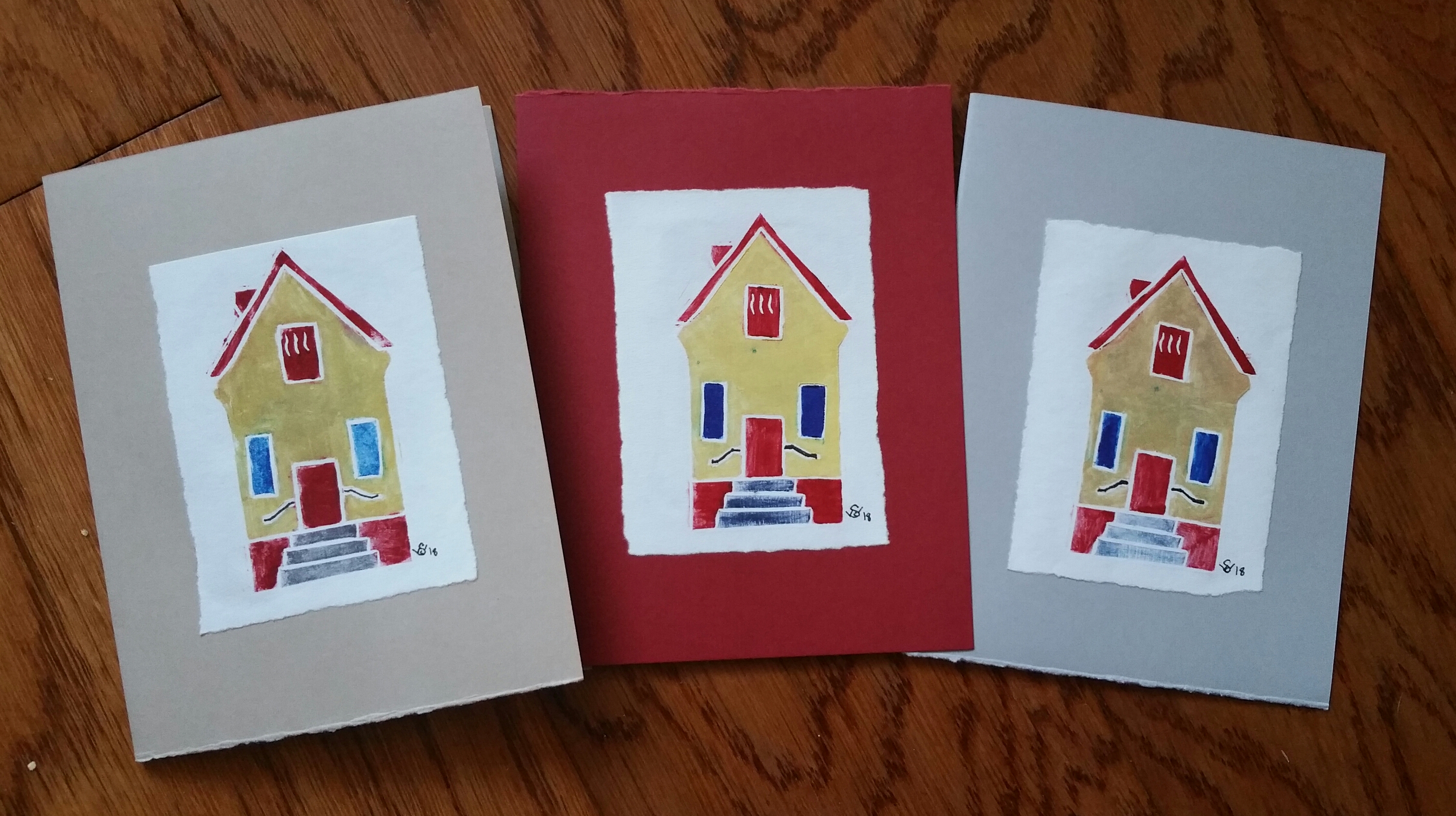
The beauty of relief printing is that you can change your colors to add variety, and I certainly did that for these prints. Some impressions featured bright yellows, while others were more brown or ochre. The print above, for example, featured lighter blue windows. 
In a few instances, I made the building green because the blue accidentally mixed with the yellow. They’re just especially attuned to holiday colors.
Once the prints were finished, I pasted them onto card stock. Rather than settle on a single color, I found a package containing red, gray, and tan cardstock and got that.
 This was a satisfying project to finish. I wasn’t sure I would have time to make cards this year, but by working for an hour or night, printing 3-4 cards at a time, I was able to finish this project within a couple of weeks.
I admittedly haven’t been sketching much since going back to grad school, but this project showed me that I can continue to make artwork while still having plenty of time for studying. I intend on remembering that for next semester by setting smaller daily sketching goals for myself. As long as you’re making something, it counts.